80TH ANNIVERSARY
Tupperware approached me to design a logo, patterns, and color pallet for their 80th Anniversary. The goal was to produce something that was modern yet leaned into nostalgia.
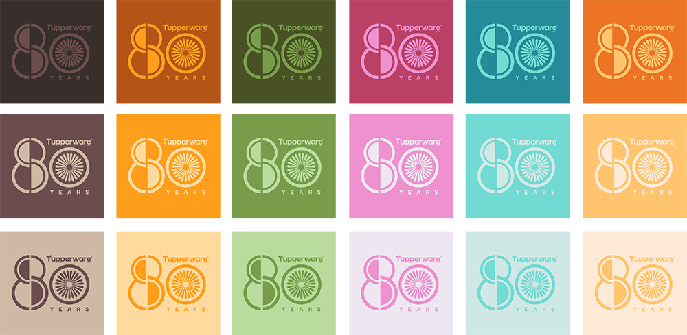
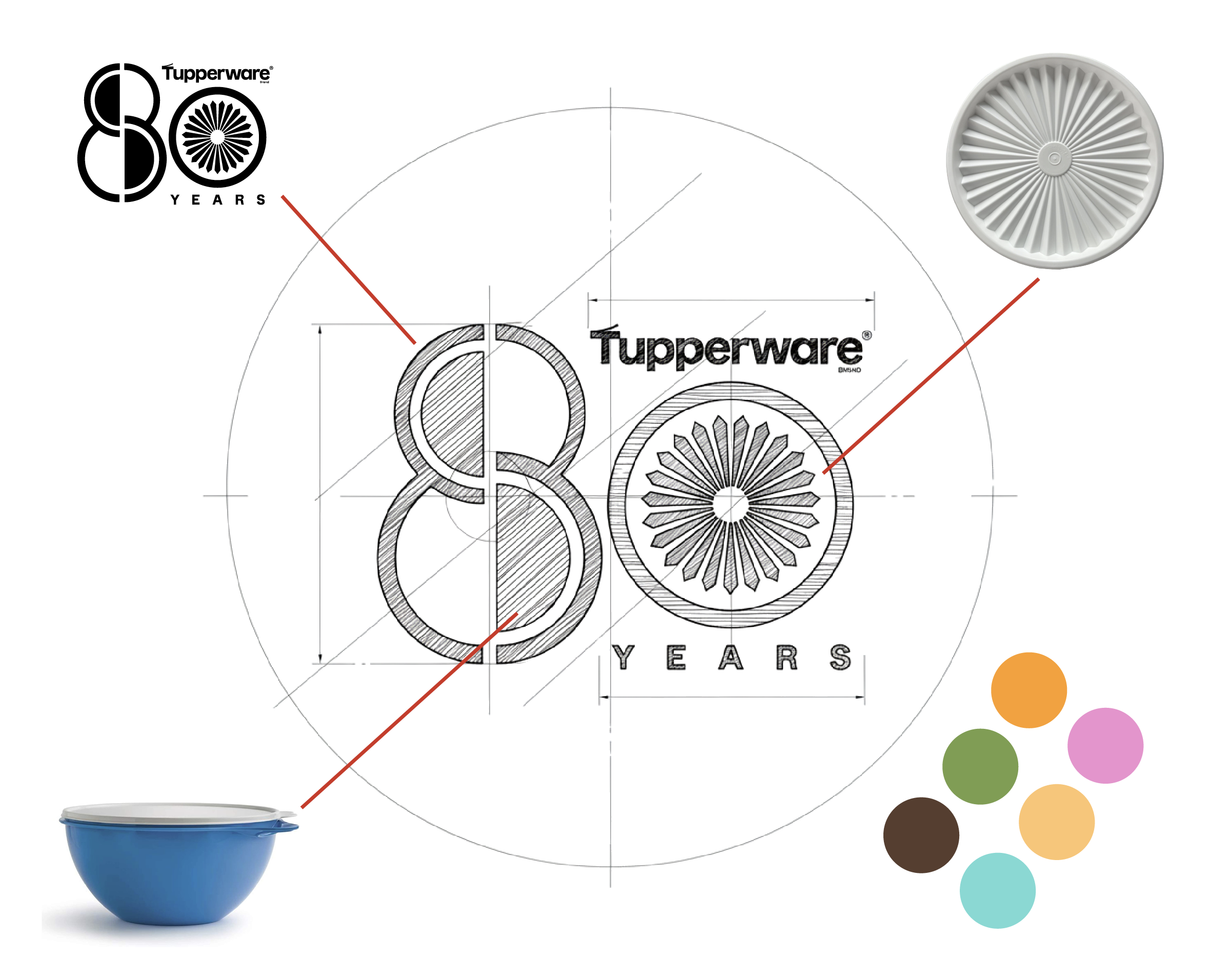
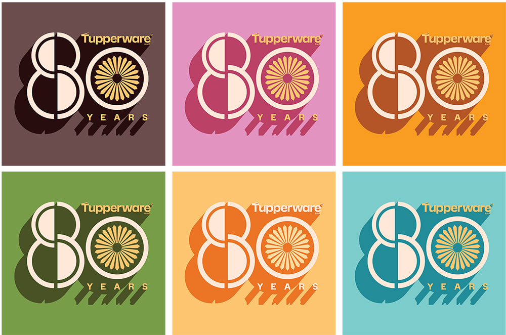
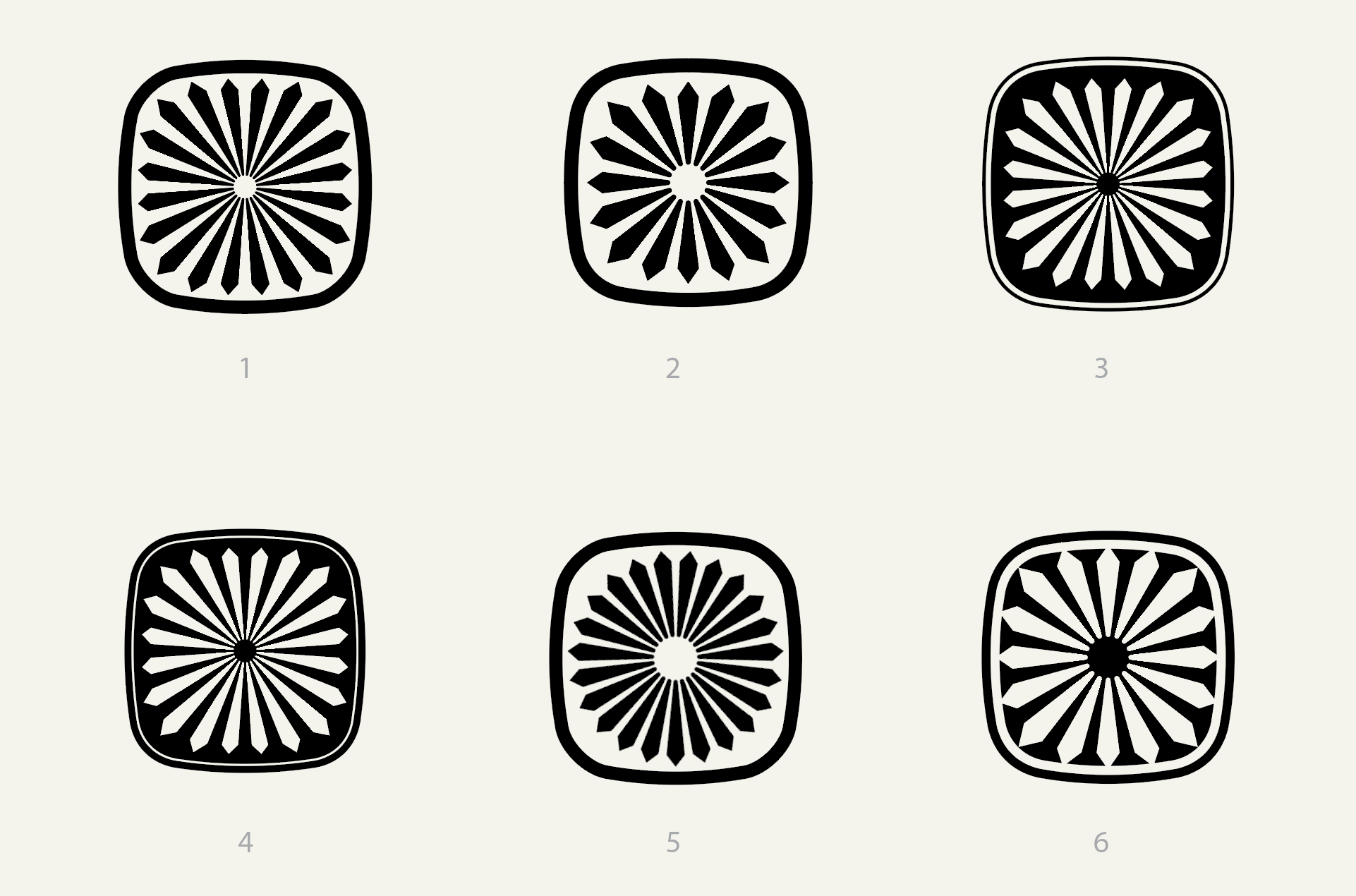
The 80th Anniversary Tupperware Brand logo was created as a celebration of heritage, function, and enduring design. At its core, the mark draws inspiration from Tupperware’s iconic radial seal pattern—the unmistakable sunburst found on classic lids that symbolizes freshness, protection, and trust. This familiar motif is reimagined as the “0” in 80, anchoring the anniversary in a visual language customers instantly recognize.
The “8” is constructed with rounded, continuous forms that echo the timeless curves of Tupperware’s earliest containers, referencing the brand’s roots in practical, human-centered design. Precise geometry and measured proportions reinforce durability and engineering excellence.
Together, the elements bridge past and present: a logo that honors 80 years of ingenuity while remaining modern, confident, and relevant. The result is a mark that feels both commemorative and enduring—much like Tupperware itself.
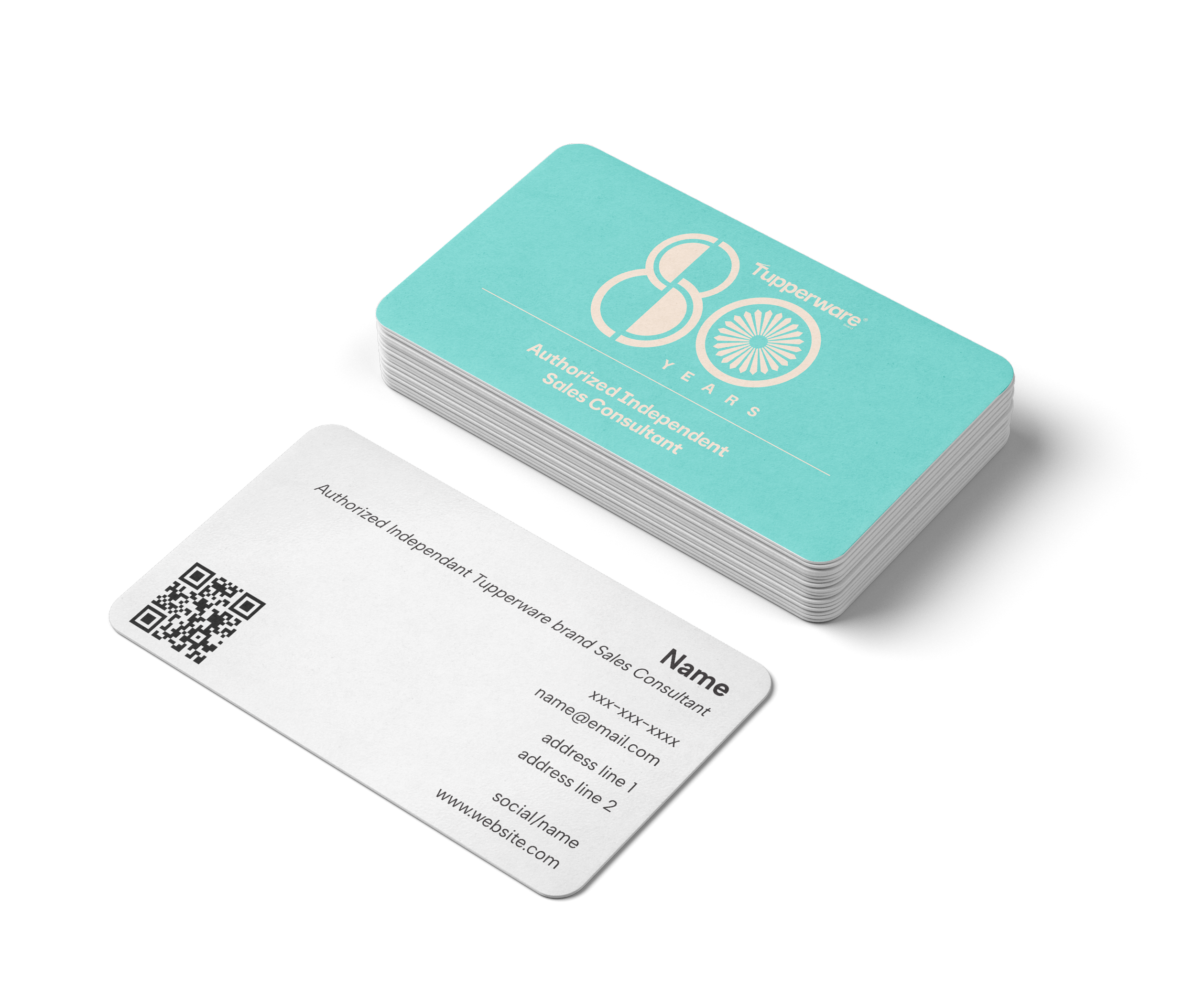
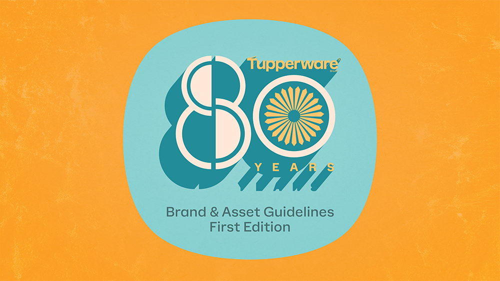
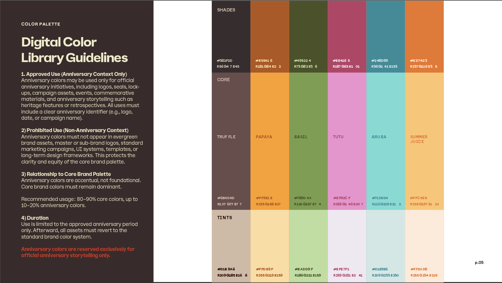
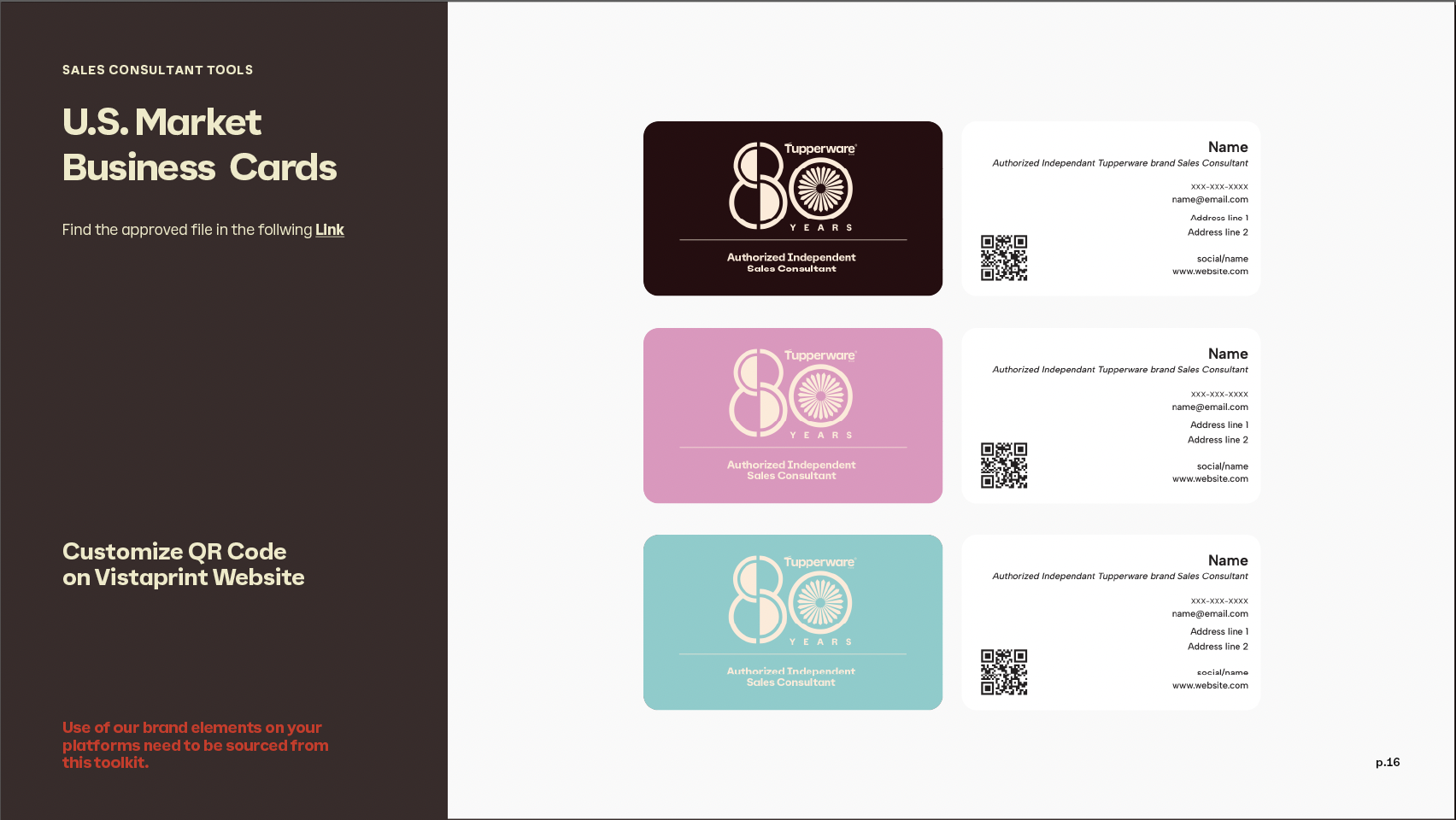
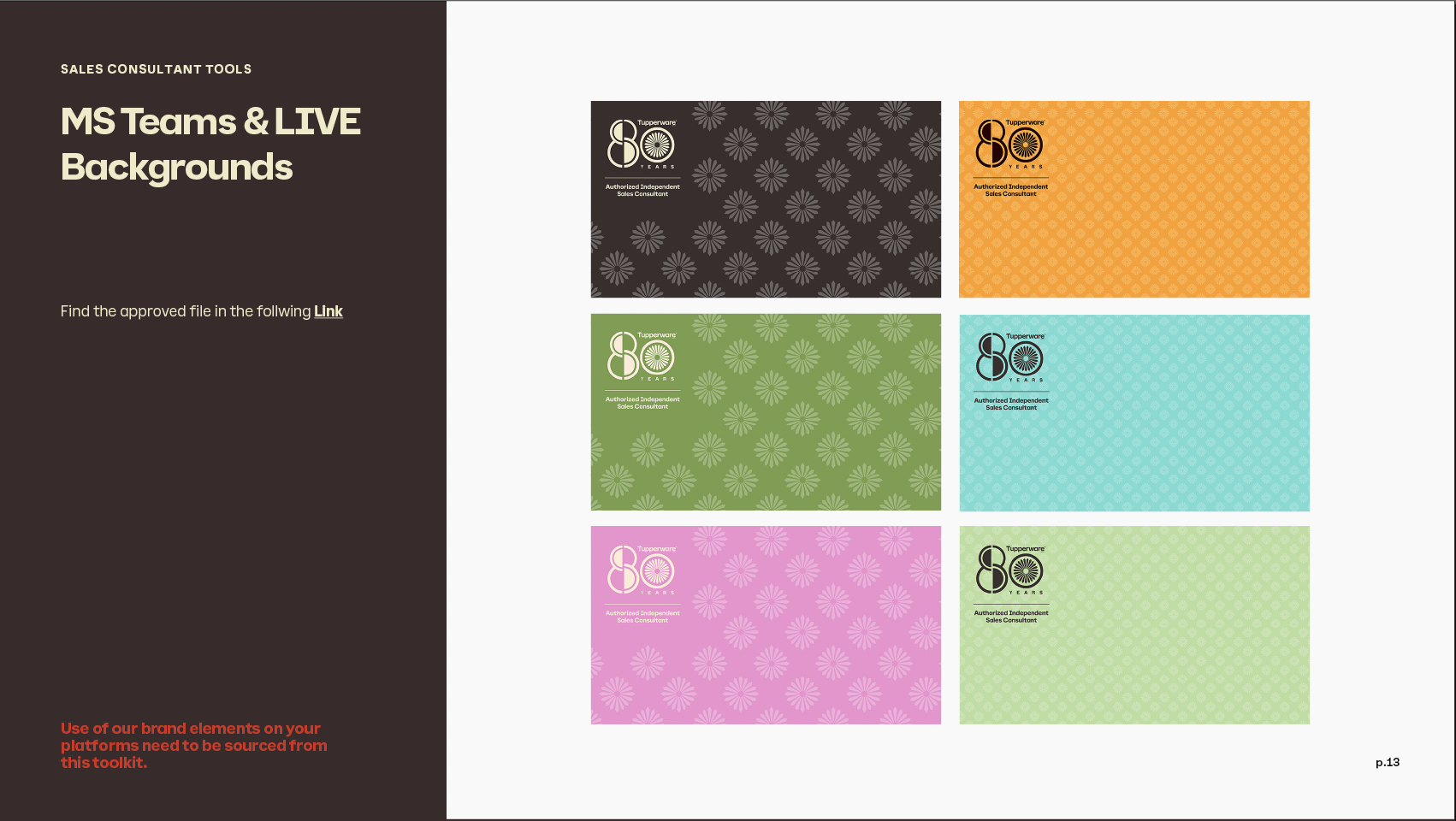
I was asked to put together an 80th Anniversary Tupperware Brand Guidelines document to help guide sales and internal design teams through usage and market deployment.
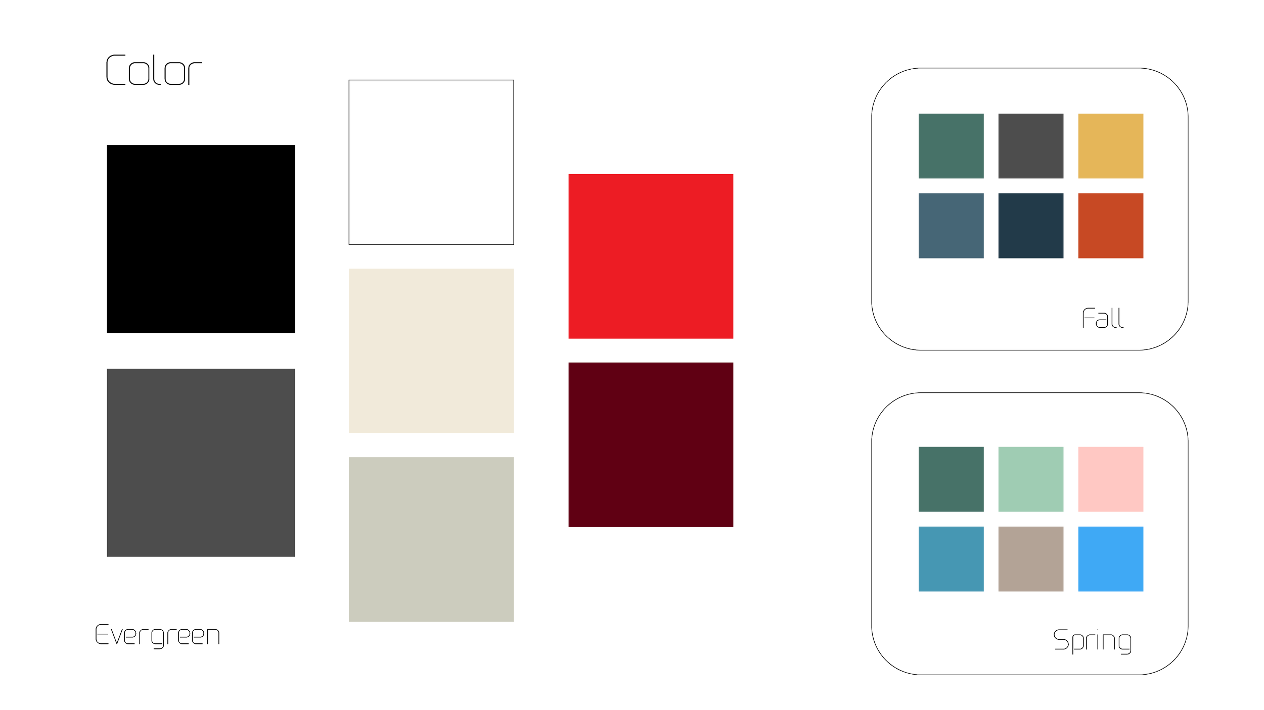
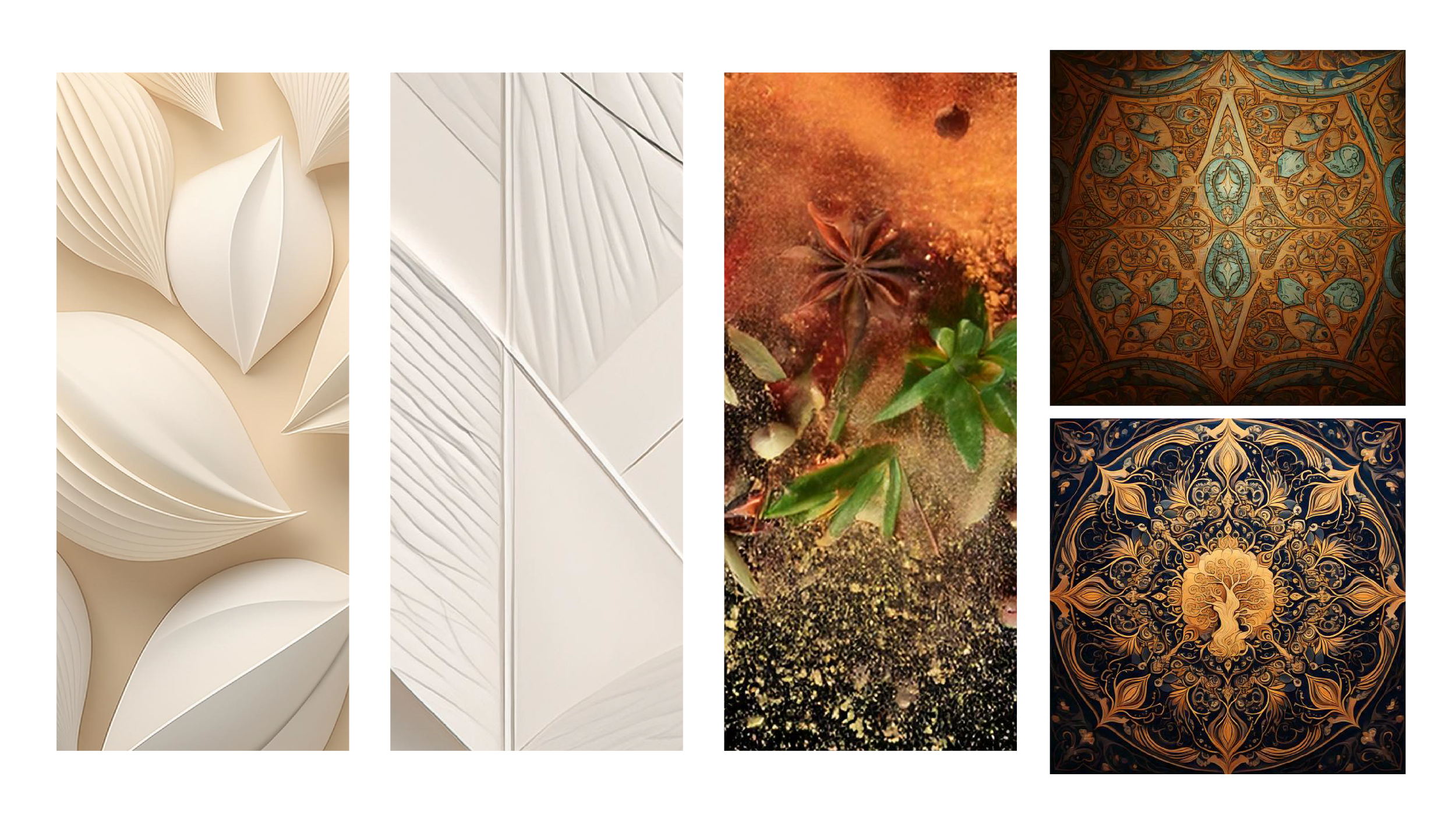
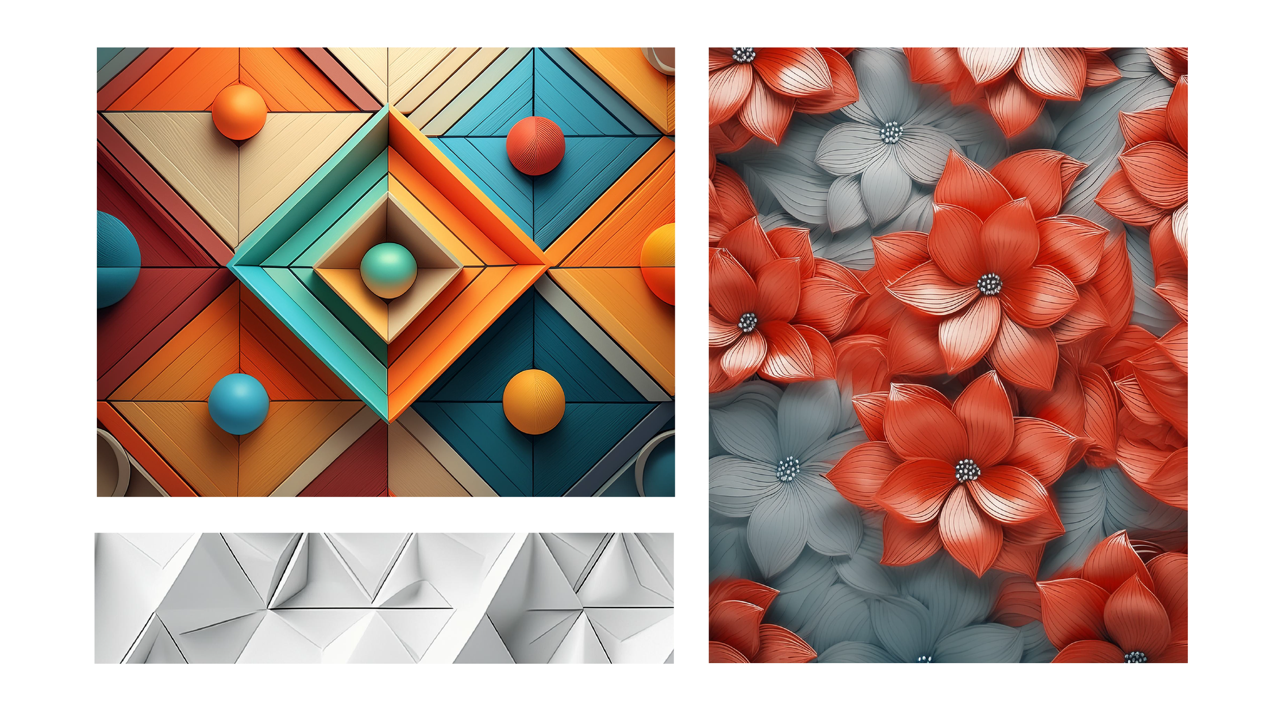
BRAND & PATTERN DEVELOPMENT
BRAND LOGO
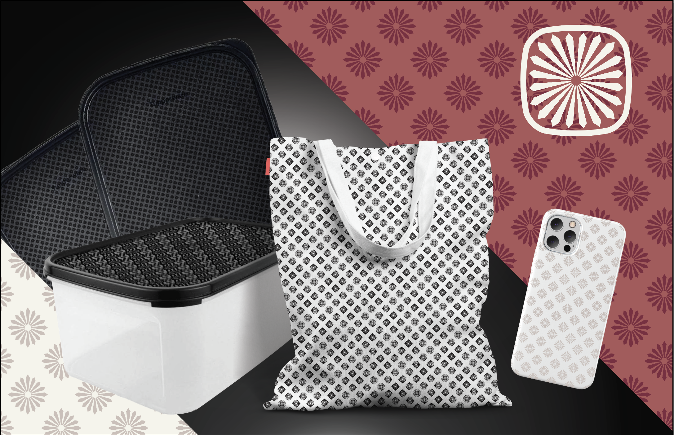
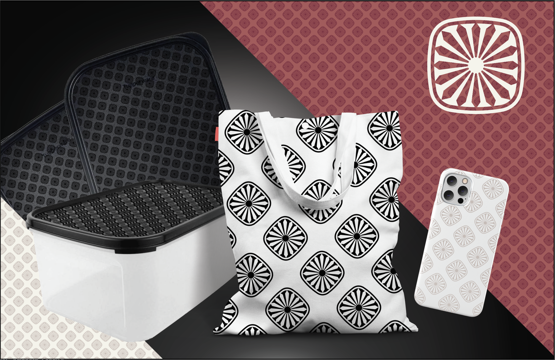
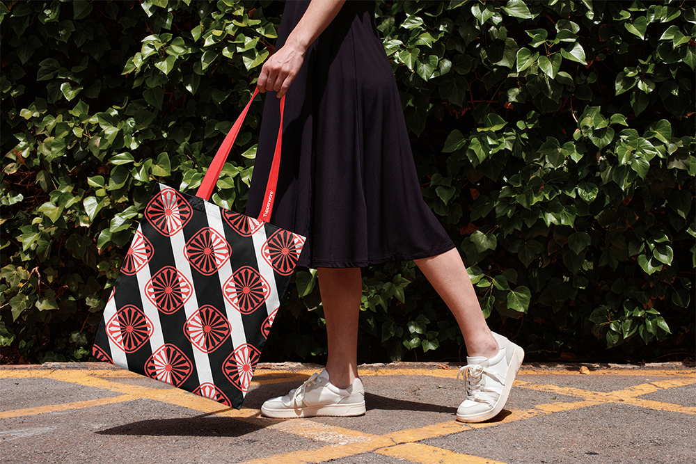
Utilizing the iconic seal geometry, I developed options for a refreshed Tupperware brand logo. The logo was designed to not only tie into the lifespan of the brand, but also act as a design element across consumer products and media much like the hidden Mickey Mouse ears people can find at Disney World. This expansive use of the logo is not only good design, it further strengthens the legal protections of the mark.

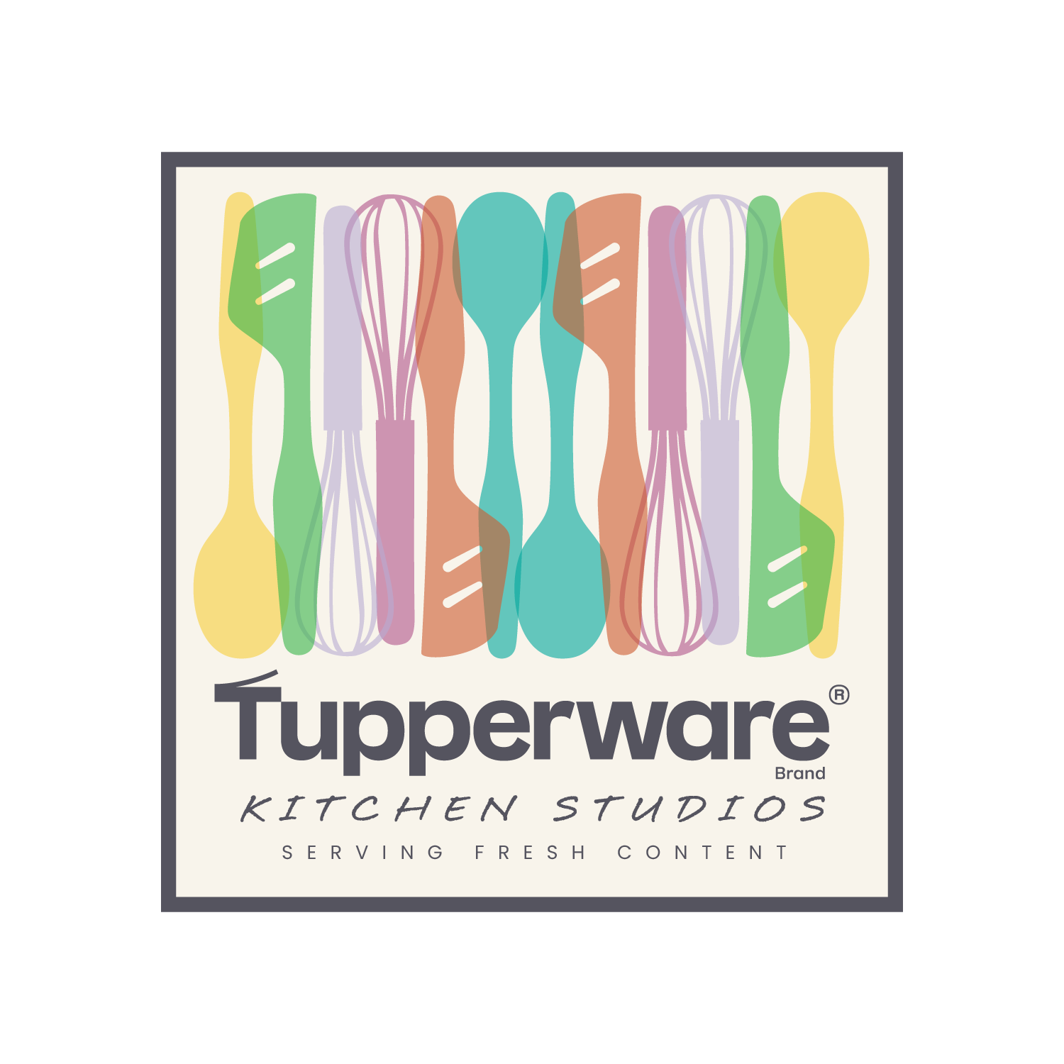
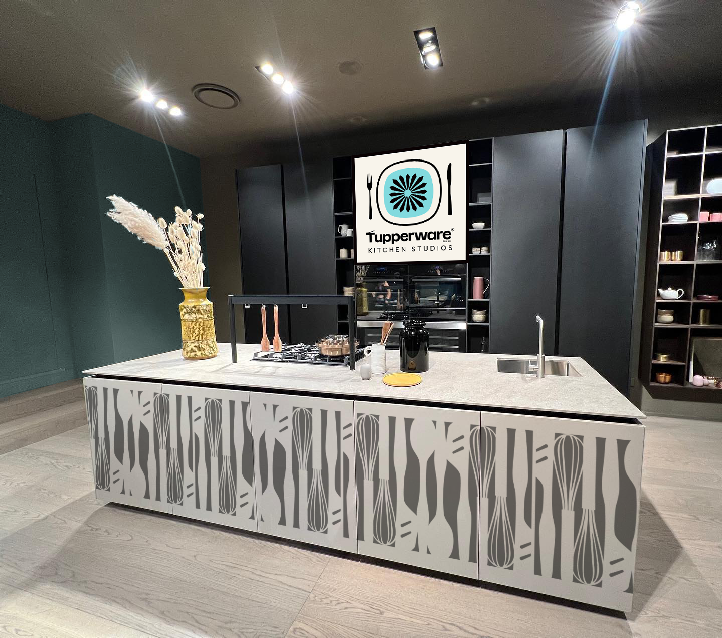
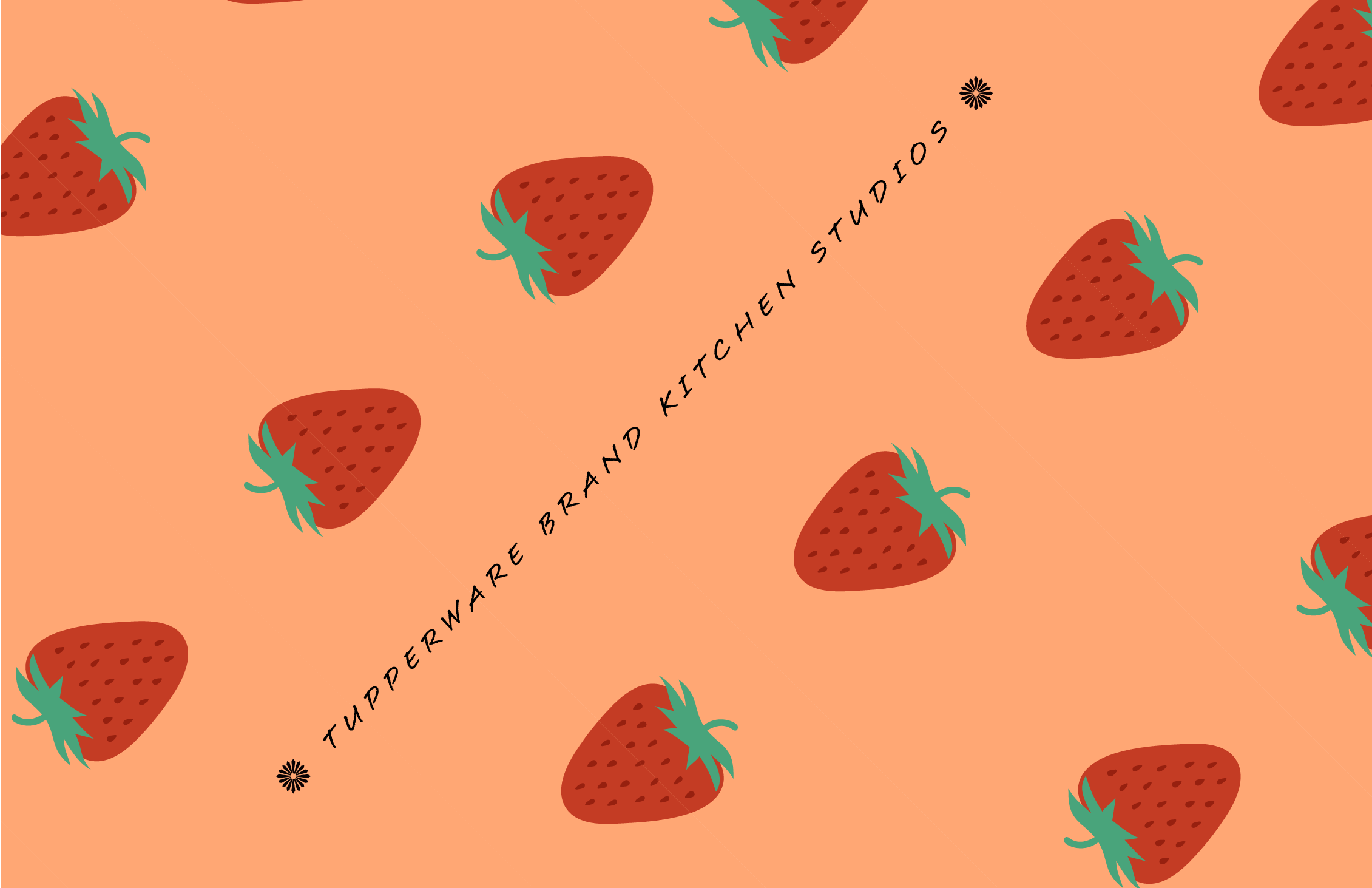
TUPPERWARE KITCHEN STUDIOS
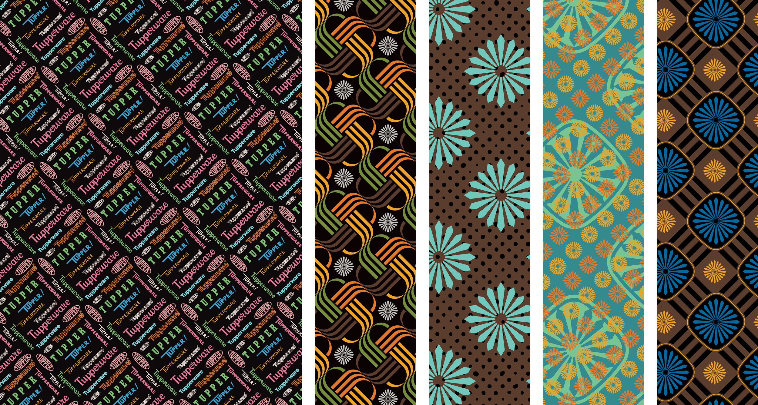
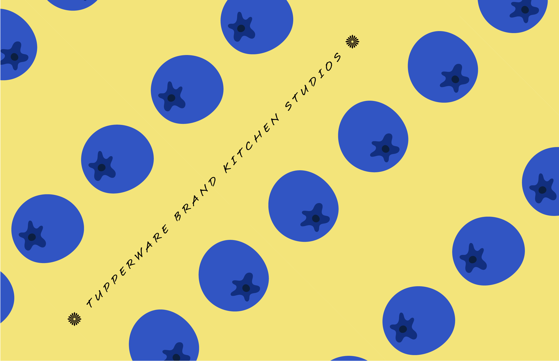
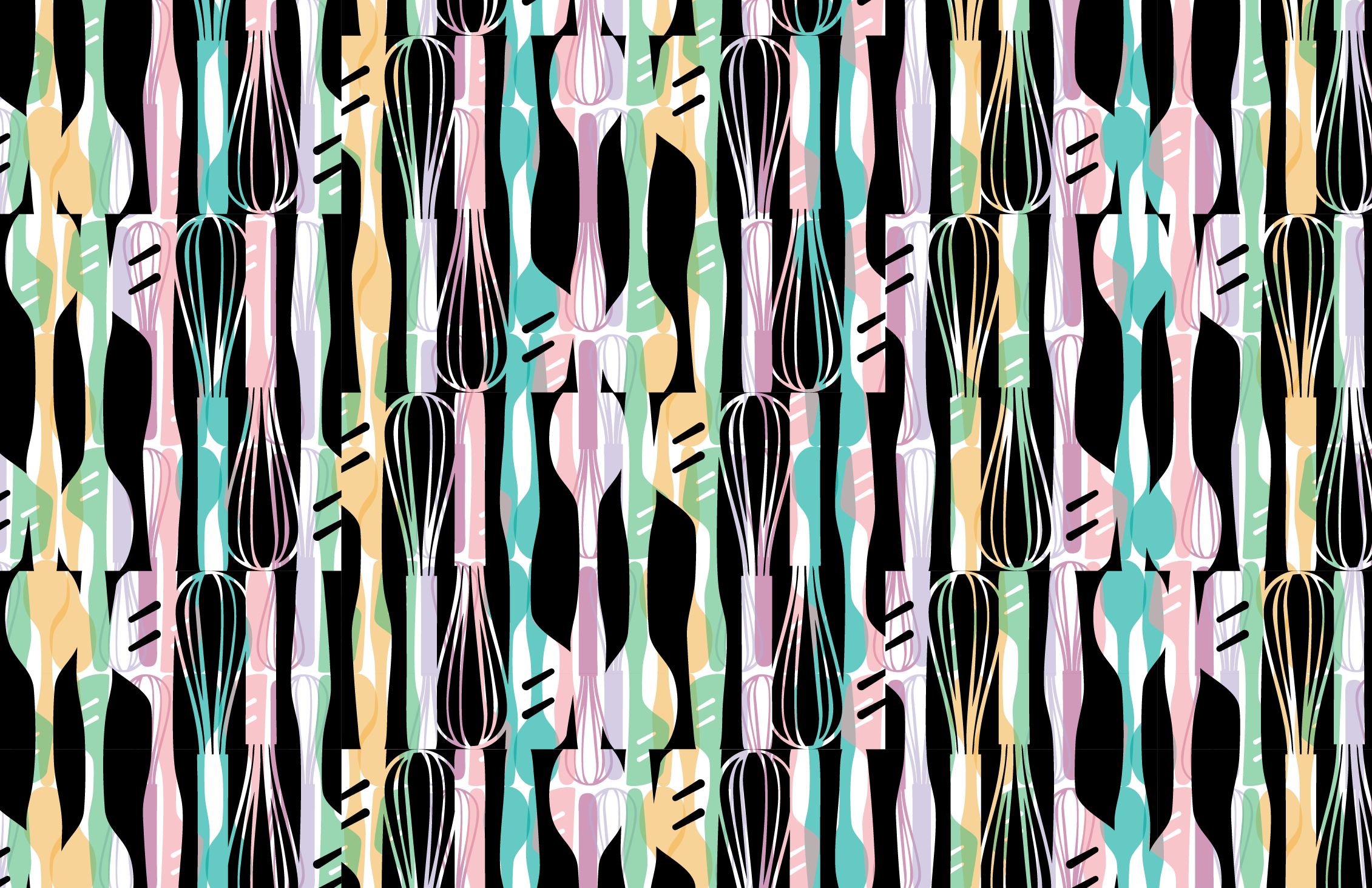
Tupperware creative team approached me to develop branding for a content studio department within their organization. The name would be “Tupperware Kitchen Studios”. Below are a few of the initial designs. The utensil silhouettes are drawn from actual Tupperware designs and baked into the logo. My goal for these designs was to build something that could work with different colors across different surfaces. I also developed several patterns. I love patterns.


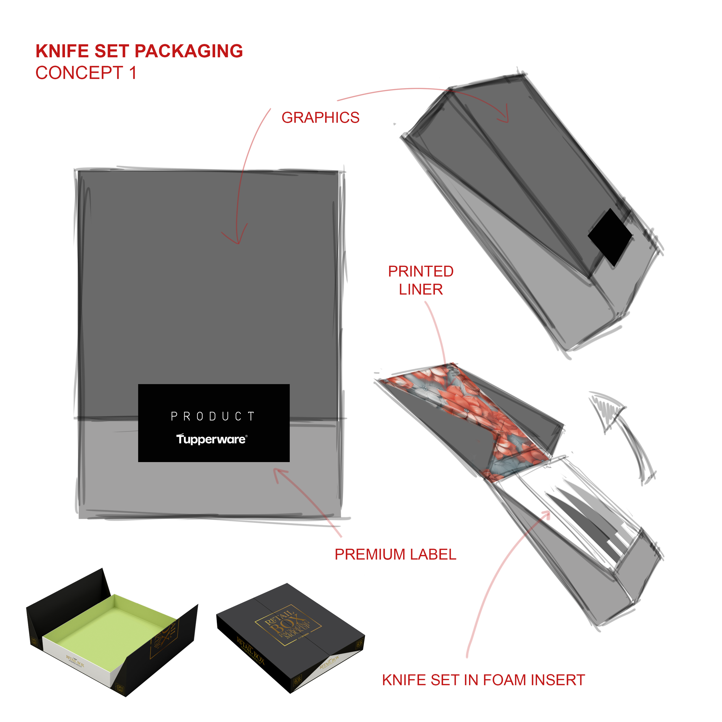
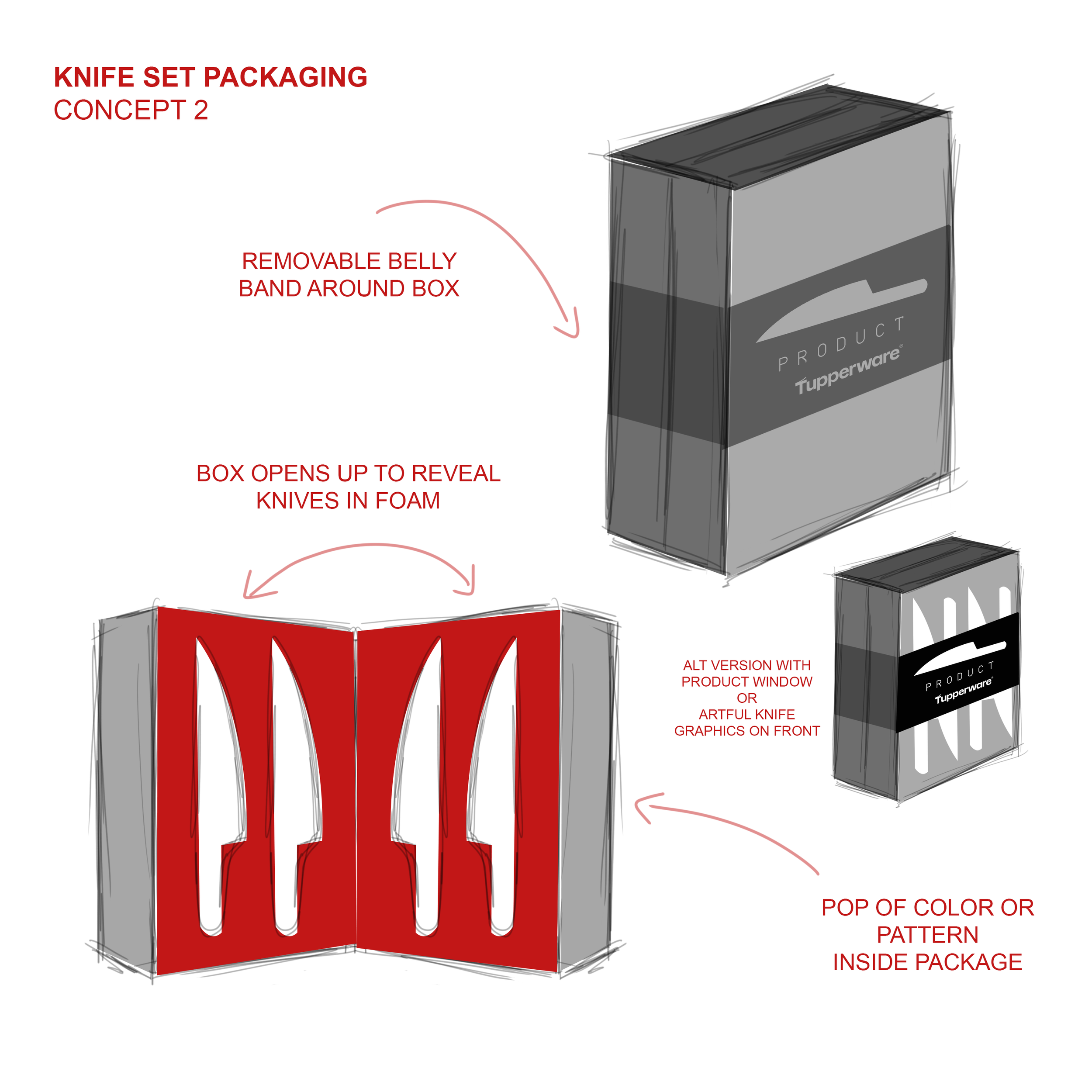
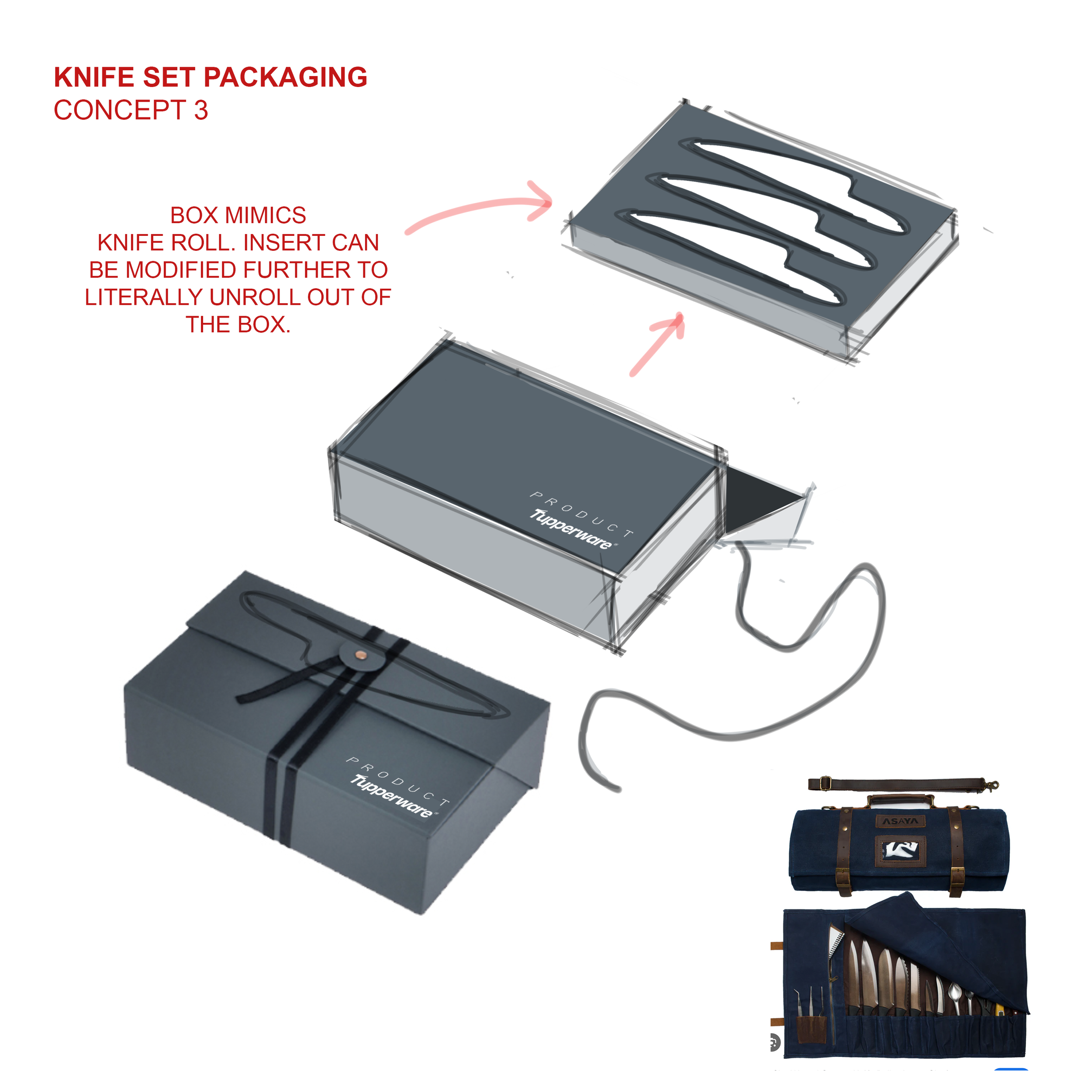
PACKAGING SOLUTIONS
I was challenged to come up with several high-end packaging solutions for a knife set sold direct to consumers. Since this did not require a strong brick & mortar shelf presence, I focused on a premium unboxing experience. The exterior features a sleek, minimalist design inspired by a mix of luxury brands and a chefs knife roll – a traditional way to carry professional kitchen knives. The tactile exterior features leathery or fabric accents, evoking a professional, culinary aesthetic. This packaging not only protects the knives but also enhances the unboxing experience, offering a sense of deep craftsmanship and quality.
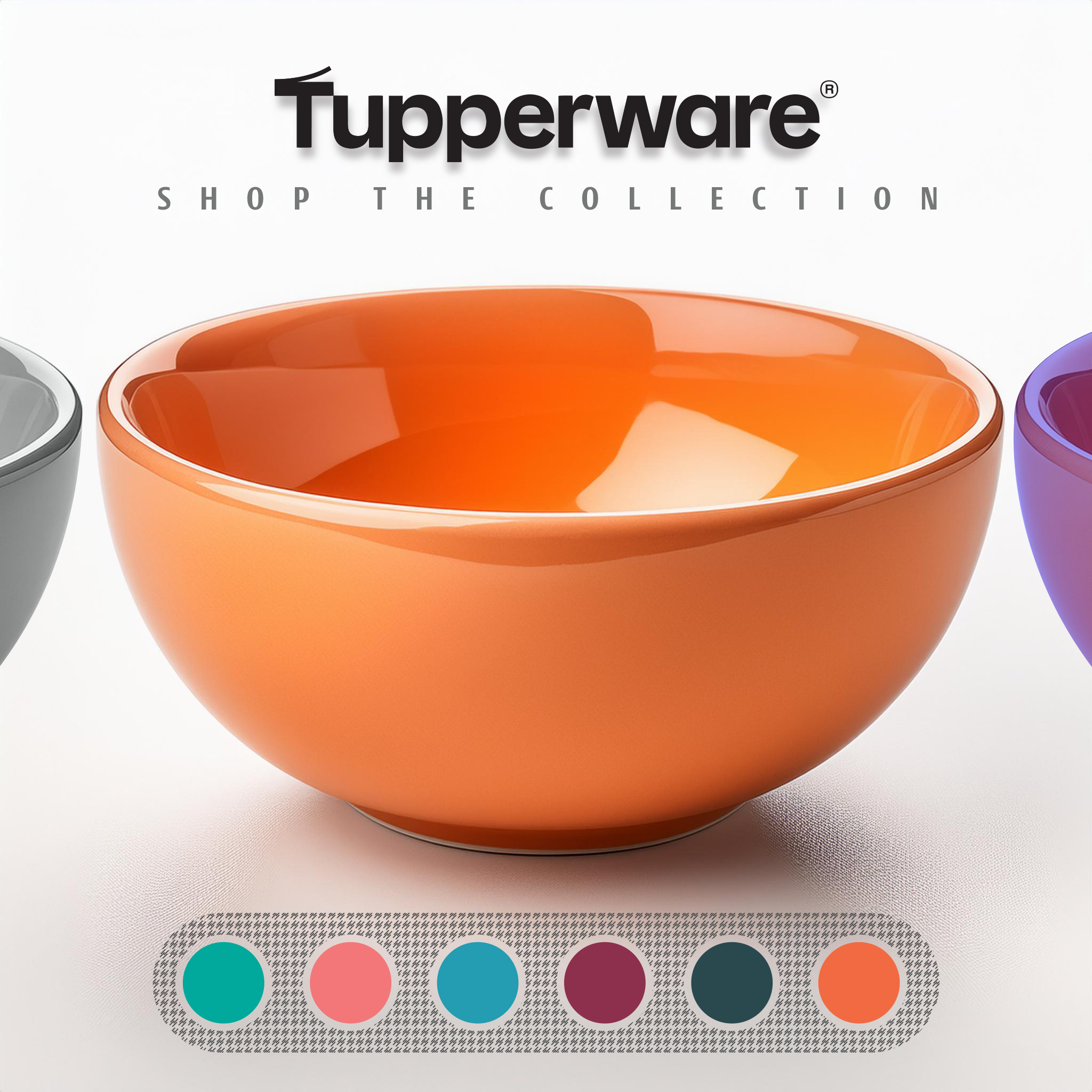
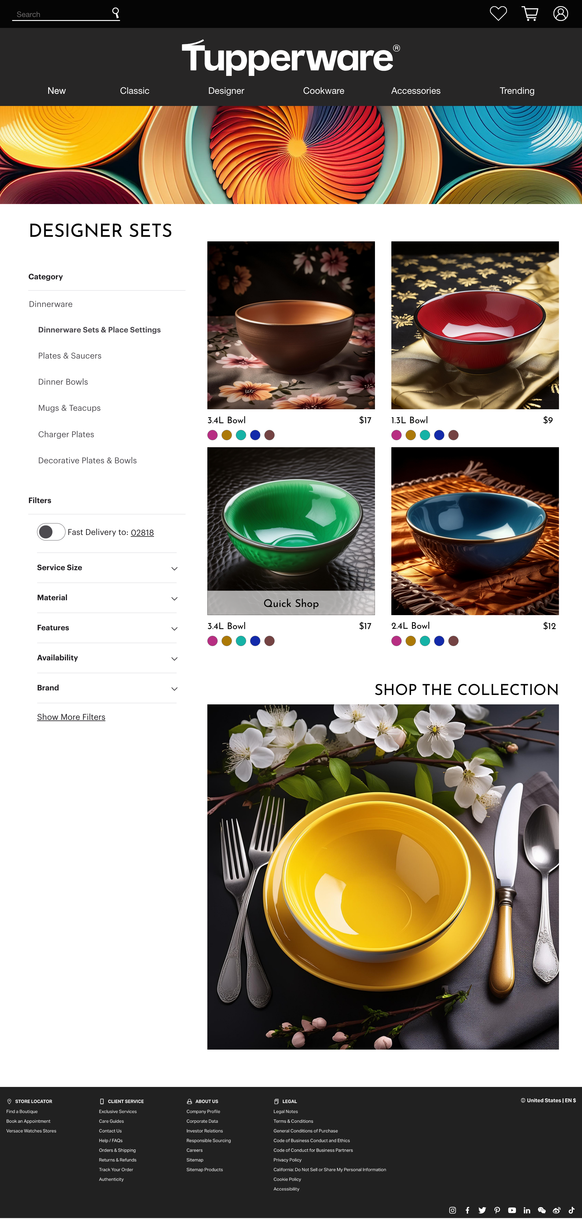
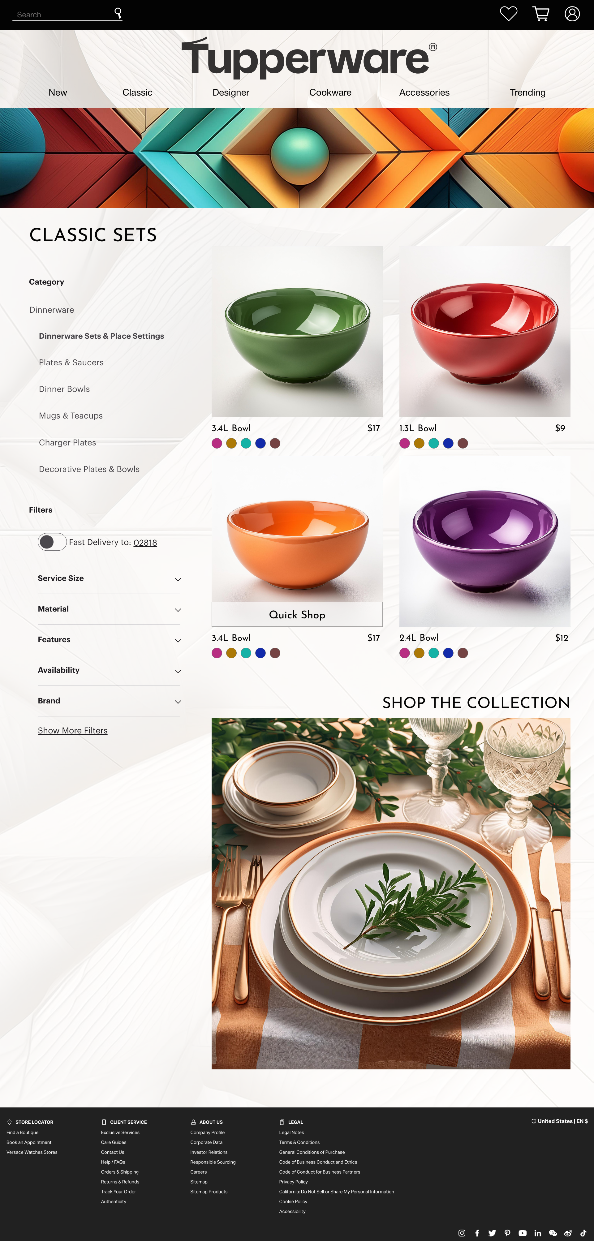
DIGITAL RETAIL
Partnering with Tupperware to do a quick exploration of visual identity. My goal was to express the brand as high-end, modern and experiencial. I focused a lot on integrating texture, structure, and organic geometry inspired by the world around us. By drawing influence from the fluid lines and shapes found in nature, the goal was to create a more tactile, warm experience for users. This design philosophy seeks to enhance the user experience by blending nature-inspired aesthetics with everyday practicality, aligning the brand with beautiful color, sustainability and modern sensibilities.
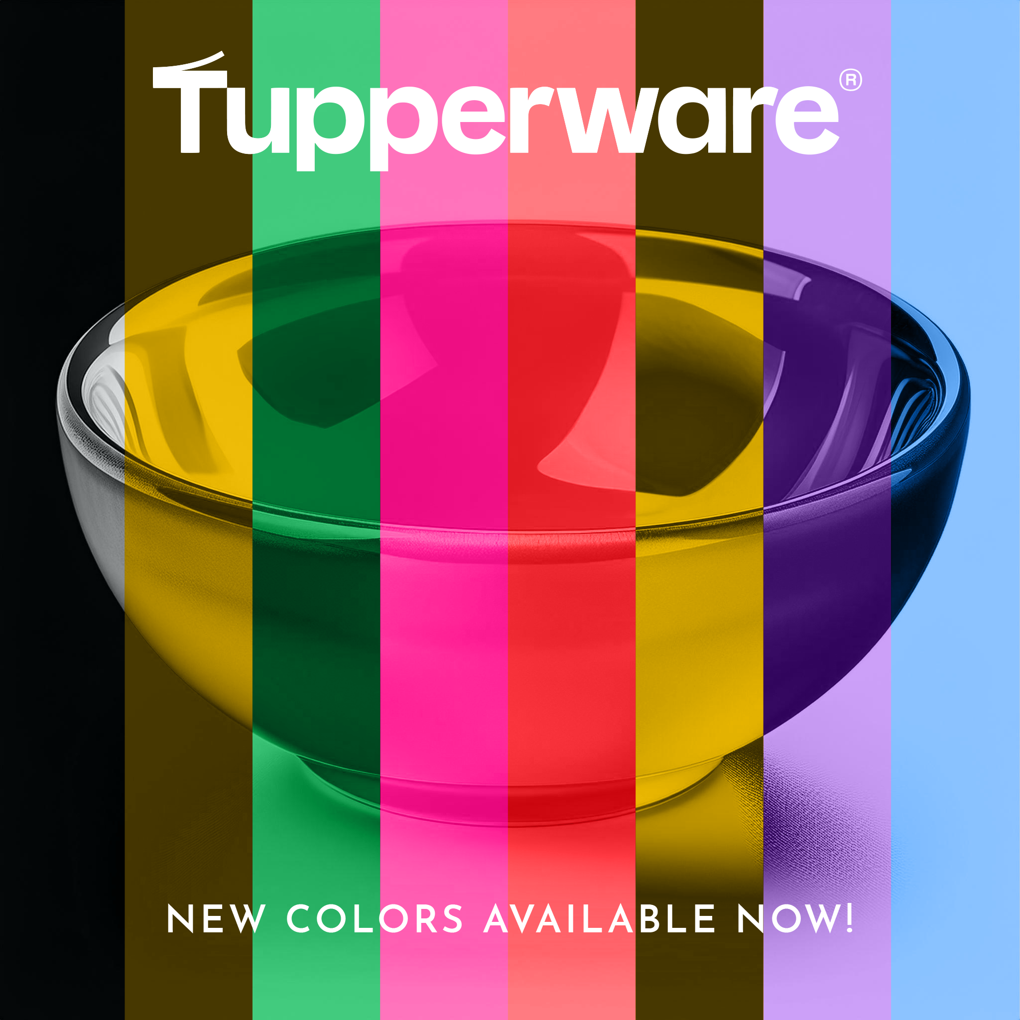
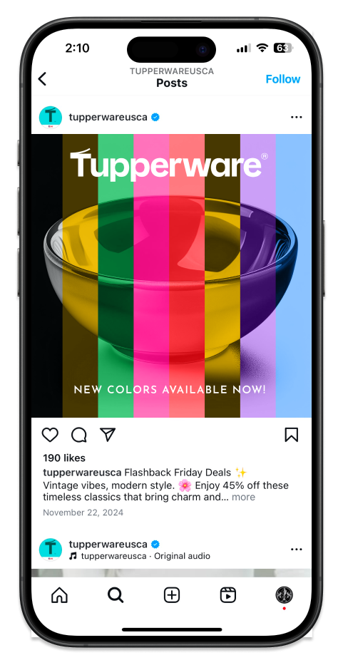
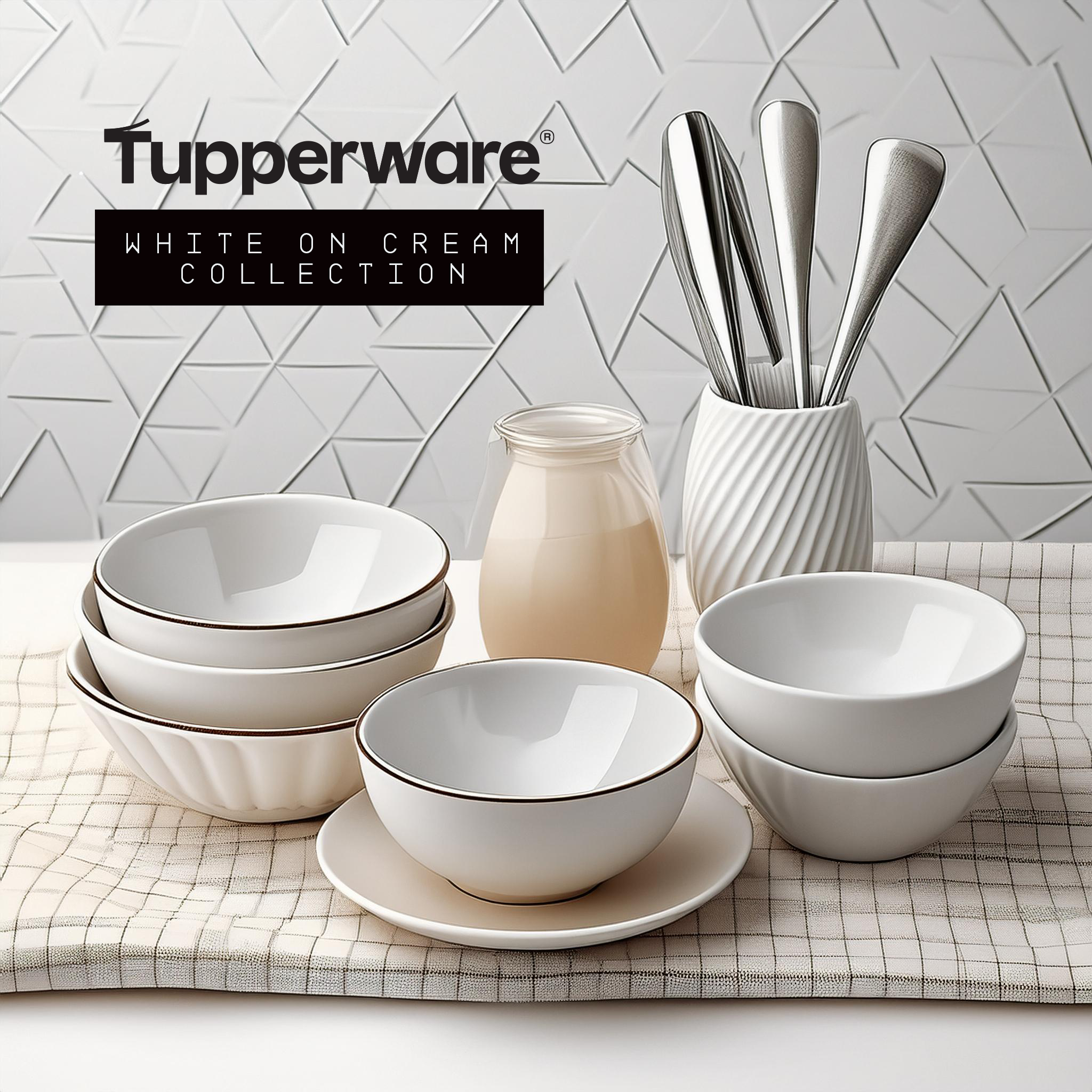
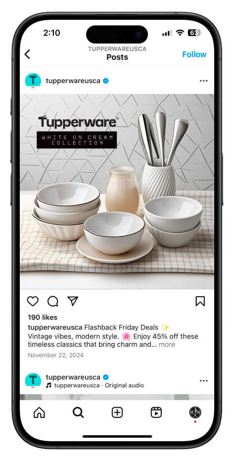
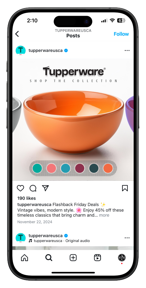
SOCIAL MEDIA